tinny: Fack Ju Goehte - Zeki Mueller wearing glasses, labeled "Geek" (fackjugoehte_zeki geek in glasses)
tinny ([personal profile] tinny) wrote in [community profile] icontalking2019-06-01 06:41 pm
Entry tags:

Activity #26 - Ask The Maker

Activity #26 - Ask The Maker 2019
this banner is featuring an icon by [personal profile] tinyumbrella


It's June, and that means it's time for Ask The Maker again!

Our poll decided that a good majority of our makers here would like to see this activity again, and I'm hoping for high participation.

Ask The Maker is where you can ask your favorite makers about how they do that thing. You can ask for tutorials, guides/"How to", or ask any other questions related to their work. Check out the Maker thread (below) for makers who have signed up and are ready to answer your questions.

You can also ask questions to the community at large, and hope that someone is able to answer them. Do this in the Questions thread (below).

By now this community has been active for over two years, and we've grown quite a bit, along with DW. This should make for an interesting mix. I for one am looking forward to interesting questions and discussions!

Please promote this activity!

You can use this code here:


The more participants the merrier! I will promote it at an official promo comm.

Here are the rules:

1) Maker-Driven


Rules for makers who want to sign up

Sign up by commenting to the Maker thread.

Please don't sign up if you know that you can't or do not plan to fulfill the requests you get within a month.

If you are an icon maker and you're willing to write tutorials, guides or answer questions (Q&A's), please sign up here with your name and where you post your work. Please state what you're willing to do/answer and if people can hotlink your work or not. Use this posting template:


There is no fixed time limit in which the signed up makers have to write these tutorials or answer questions, but it would be nice if everyone managed to post their answers within the next month. I will make the master list post around mid-July (i.e. in six weeks). Even if you take longer than that, please try and answer your questions. Please let people know if you find out you cannot fulfill the requests. Try not to leave people hanging.

All tutorials/Q&A etc. need to be posted in your community/journal and be posted publicly. In-depth explanations on tutorials is not a must, but highly encouraged.

When you finish your requests, post a link to them as a reply to the original request comment here. That way, I and the person requesting will be able to see them and I can add them to the master list.


2) Question-Driven - I have a question and anyone can answer


If you have a question about techniques, a specific look, etc, but you can't ask any maker directly (e.g. because they didn't sign up or are not on DW or because your question is more of the general kind), you may ask your question in the Questions thread.

Be aware that there is no guarantee that you'll get your question answered. You will increase your chances by asking specific questions about specific techniques and by giving icon examples, from different makers if possible. Please don't ask about single specific icons, nobody should feel pressured into participating.

Please don't hotlink icons from other makers without asking them. Reupload the icons (e.g. to imgur.com or postimages.com) instead.


What's What


Question categories and examples

Guides - a guide is a general explanation post. The maker will make a post explaining how to achieve a particular effect, use a technique, use a tool, etc.

#1 - Text and typography in gimp by [livejournal.com profile] cool_spectrum
#2 - A guide lighten dark bases from last year by [personal profile] tinny

Tutorial - a tutorial is a step-by-step description of how to make a particular icon. Only the maker of an icon can make a tutorial of how they made that icon. If you ask for a tutorial, you must provide said icon with your question. This kind of question only makes sense in the Maker thread.

A tutorial by [personal profile] fueschgast
Example tutorial #2 by [personal profile] word_never_said

Q&A - everything that doesn't quite fit the first two categories. Ask away, hope for the best. :)


Maker thread

Questions thread
tinyumbrella: (stargate [ atlantis ])

Re: Maker Thread

[personal profile] tinyumbrella 2019-06-07 07:44 am (UTC)(link)
I love your icons where they are quite monochrome, i never seem to get the colours right on those - eg that Villianelle icon up there, or even the last one. Just...working with more monochrome icons? IDEK

I like that third icon as well as it's so clear for such a tiny subject - any tips and tricks on that one?

Obviously a cropping guide would be amazing, i love your close crops on hands and faces that just look awkward when i try!

THIS IS A LOT, just pick one to focus on :)
tinyumbrella: (lot [ zari ])

Re: Maker Thread

[personal profile] tinyumbrella 2019-06-07 07:46 am (UTC)(link)
Your texture use is really cool and interesting, do you have any process on how you pick and apply textures? I know that's really broad, let me know if you want me to be more specific!
tinyumbrella: (the 100 [ bellamy ])

Re: Maker Thread

[personal profile] tinyumbrella 2019-06-07 07:47 am (UTC)(link)
yes, i think so! I will work on something this weekend :)
tinyumbrella: (angel [ illyria ])

Re: Maker Thread

[personal profile] tinyumbrella 2019-06-07 08:06 am (UTC)(link)
No that's really cool, i like your idea of having different layers and modifying the colouring!!

thanks :)
ideare: (Default)

Re: Maker Thread

[personal profile] ideare 2019-06-07 07:33 pm (UTC)(link)
what is your process in deciding on how to use a texture? deciding if a texture should be used as a background or over the image?
alt alt alt alt alt
ideare: (Default)

Re: Maker Thread

[personal profile] ideare 2019-06-07 07:36 pm (UTC)(link)
would you be able to do a guide/tutorial on how you made this parker icon?
alt
tinyumbrella: (the rookie [ nolan ])

Re: Maker Thread

[personal profile] tinyumbrella 2019-06-08 01:02 am (UTC)(link)
oh +1 on that, it's beautiful!
tinyumbrella: (the 100 [ clarke colourful ])

Re: Maker Thread

[personal profile] tinyumbrella 2019-06-08 01:09 am (UTC)(link)
That was really good!! thank you for the time it took to write all this up.

I don't think i've ever used Linear add before so i will have to give that a shot, it's suprising how little you can do to make an icon amazing.

I usually cut out on 200x200px but maybe i should try doing it with full size one of thes days.

I like your lighten layer idea on colors to make it look consistent! that's really cool!
tinyumbrella: (killing eve [ addicted to you ])

Re: Maker Thread

[personal profile] tinyumbrella 2019-06-08 02:23 am (UTC)(link)
I hope i've gone in depth as much as i can, hope this is useful: https://oh-crime.dreamwidth.org/36338.html
lavenderspark: (Default)

[personal profile] lavenderspark 2019-06-08 02:50 pm (UTC)(link)
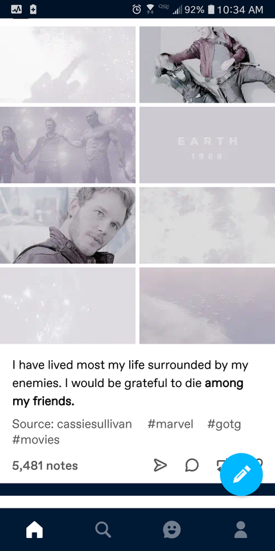
Ok, the only place I'm seeing what I want to achieve is on Tumblr, so I just took a screen grab. I'm wondering how to get the coloring on these. Muted and soft, but not really altering the original coloring? I don't know how to explain it.

lavenderspark: (Default)

[personal profile] lavenderspark 2019-06-08 05:12 pm (UTC)(link)
Idk if this will help, but I cropped it down to make the original color easier to see. Gamora is still green, but the color is definitely muted.

Edited 2019-06-08 17:16 (UTC)
lavenderspark: (Default)

[personal profile] lavenderspark 2019-06-08 05:28 pm (UTC)(link)
I didn't see this until after I posted my second comment!

I'm sure I can find those settings in my program. Things aren't hard to find, I just don't always know what they're called/what they do. I'll have to play around with it and see what I can do.
lavenderspark: (Default)

[personal profile] lavenderspark 2019-06-08 05:31 pm (UTC)(link)
Yeah, it's probably something I'll have to tinker with, but at least I know what to look for now! Thank you!! These types of gifs are all over my Tumblr and they're so soft and pretty.
tinyumbrella: (who [ 13 close ])

[personal profile] tinyumbrella 2019-06-09 01:28 am (UTC)(link)
you did an amazing job with this!!!
seraphina_snape: Parker from the TV show Leverage. She is wearing a white shirt and is smiling. (Default)

Re: Maker Thread

[personal profile] seraphina_snape 2019-06-09 07:50 am (UTC)(link)
Well, the super vague answer is "whatever looks good". :p

But I've been thinking about this for a couple days now and I think I either go for matching colours or contrasting colours.

Matching colours:
I like using matching colours because it makes the icon look more harmonious.

Here the background picks up on Eve's lavender shirt


And this one picks up on the green dress


IDK, it just makes the icon more cohesive.

Contrasting:
I like creating contrast by using a dark texture with a light-coloured focus object, or a light or bright-coloured texture to offset the dark focus object:


Also great are textures that somehow "frame" the focus object, like these:


All of the above I use for my negative space icons (60% or so of all my icons are negative space icons). If an icon is not negative space, I use mostly light textures or colourful ones that I can add to the icon to make it less boring.


The actual process is as follows:
1. make basic icon
2. think "this needs some kind of texture"
3. open "favourite textures" folder on pc (note: this folder is like 87% textures by lookslikerain and 13% other, because I LOVE textures by lookslikerain - they're super colourful and I've never not been able to find one that works)
4. scroll through the textures and try out whichever texture catches my eye
5. if it's difficult to decide, duplicate the icon and look at them side-by-side
6. pick the one that looks best and save
(sometimes there is a step 5a. decide it looks great but needs something more, so repeat steps 4 and 5)

And that's about it!
seraphina_snape: Parker from the TV show Leverage. She is wearing a white shirt and is smiling. (Default)

Re: Maker Thread

[personal profile] seraphina_snape 2019-06-09 08:17 am (UTC)(link)
For me it depends on the icon and the crop: if it's a negative space icon, the main texture goes behind the focus object (aka the person). If it's not a negative space icon, the texture goes on top of everything (or at least on top of strategic parts of the icon).

I make a lot of negative space icons because I feel like the background is sometimes too busy and distracts from the focus of the icon. But just leaving things blank is a bit boring, so I go looking for a texture to work with the icon.

If it's not a negative space icon, it's very often a close or mid crop icon (I don't like full body icons, so I rarely make them unless prompted), meaning there is very little room around the edges for a texture unless it's on top of everything. So in these cases I pick textures that make the icon a little less bland and boring (like in the first example icon you gave) and that work well with the screen or overlay or soft light blend modes. I use light textures a lot, too. Sometimes though I want to obscure parts or make a certain statement like in the second example icon - the texture obscures Donna's eyes and it reminded me of the season one finale where Rose looked into the heart of the TARDIS; I thought it was fitting for the Doctor Donna. *g*

Occasionally I have a case like this one:

Technically the texture could have gone behind Flynn, but I remember that tried it with several different blend modes and with the texture tilted this way and that way, but this looked best.

I also generally try a few different textures and look at them side by side to see which texture works best with the icon.

(You might also want to check out this comment because [personal profile] tinyumbrella asked a similar question.)

I hope that answered your question!

Page 2 of 3